Sunday, October 31, 2010

kahoot.org - An Online Community Paying it Forward

Big ideas on a paper napkin are our favorite concepts to bring to life. When we sat down with Dr. Julie Panchura, the vision was broad but the goal was clear: Connect businesses to customers, volunteers to non-profits, and create a social and economic win-win-win.

Dr. Panchura invited Studio Absolute to name and create a brand identity, propose a monetization plan, and design and build a website to serve as a hub for this philanthropic community. Out of Dr. Panchura’s vision for a streamlined “Pay It Forward” movement, came www.kahoot.org.

How it works:

1. Set up a volunteer profile and download vouchers.

2. Contact one of the affiliate businesses to establish details of the offer.

3. Volunteer with a participating nonprofit in exchange for a discounted rate with the business affiliate. The non-profit will validate the voucher.

As a business affiliate, Studio Absolute assigns a value of $20 to each volunteer hour and applies that towards the cost of website design, branding strategy and design services. The customer simply searches kahoot.org for design services in Bend, contacts us to confirm the details, then after donating their volunteer hours, Studio Absolute will redeem their vouchers.

We feel like this is a great opportunity to make our services more accessible to small businesses while encouraging a spirit of volunteerism within our community. We hope you’ll join us in setting up a profile for your business or non-profit, or search the growing database for affiliates offering significant discounts in exchange for your volunteer time.

Thursday, August 19, 2010

Studio Absolute Gives the Advertising Federation a New Look

When Studio Absolute was approached to redesign the AdFed of Central Oregon website, we were excited for the opportunity to create an online experience that we would enjoy using regularly as AdFed members ourselves. Our motivation for donating the design was admittedly selfish knowing it would make our lives easier in the long run.

Central Oregon boasts an impressive network of creative talent that has been recognized globally as having merit comparable to that of a much larger metropolitan area. We saw the AdFed website as an opportunity to showcase that talent while providing an easily navigated hub for creative resources.

Websites are increasingly the first interaction a potential new member or customer has with a company or organization. Grand assumptions about service and quality are made based on the design and ease of navigation throughout the site. If it’s a painful experience online, the visitor forms a subconscious impression that your service or product quality is equally lacking.

The crisp, clean, editorial approach to the new AdFed website delivers on the true value that AdFed of Central Oregon provides its members. It is professional, credible, and a worthwhile investment of time and membership dollars.

Thanks, AdFed for the opportunity to design the new website and for your on-going commitment to the advertising community!

You can check out their new site here: www.adfedco.org

Tuesday, April 13, 2010

Studio Absolute Print Design

The printing of the Haiti | 5 booklet prompted us to post a sampling of Studio Absolute print design to Slideshare. We've been blessed to work on some really meaningful projects this last year. Check it out!

Wednesday, March 3, 2010

Studio Absolute Moves to Tumalo, OR

April 1 marks the first day in our new Tumalo studio. For the next few weeks, we are working hard to turn our freshly built-out space into a work of art that reflects the progressive brand of our firm.

Tumalo, for those of you unfamiliar with the area, is a little gem on the outskirts of Bend, Oregon. The Deschutes River is only about a block away from the studio! We appreciate that we’re close enough to Bend to be accessible, but far enough out that it feels like we’re on a creative retreat. We're also excited to share the same building as Bellatazza Coffee and world renown photographer, Kevin Kubota of Kubota Photography.

On May 13th, from 4:30-6:30 we are celebrating the move by hosting an AD Fed Mixer/open house at the new location. The studio is located at 19855 4th Street. The mixer is being sponsored by Volcano Vineyards and is open to the public. An RSVP is greatly appreciated.

April is going to be a big month for us! We're also preparing to launch the new Studio Absolute website in April coinciding with the move. The new studio space has a fresh, urbane style that we wanted to communicate through every touch point of our brand. From our physical location to logo, print marketing material, or website–each interaction with our brand should be telling the same story. The new website will be an extension of our brand and will deliver the same user-friendly experience our clients enjoy about working with us.

For more information about Studio Absolute or the upcoming AD-Fed Mixer, please contact Cheryl McIntosh at 541-280-0086 or cheryl@studioabsolute.com.

Cheers!

Press Release - Lenity Group Rebrand

A NEW NAME, AND A FRESH APPROACH TO SENIOR HOUSING PLANNING AND DESIGN

Lenity Group Brings a Fresh Approach to Senior Housing Planning & Design

2010 Marked a new beginning for Lenity Group, a Salem-based senior-housing planning and design firm. Principals, Kristin Newland, Marcus Hite, and Dan Roach, AIA took the helm after Cliff Curry, a long-time Salem and Bend resident, retired in December from his role as President of Curry Architecture.

Curry founded Curry Architecture nearly 30 years ago. Together with partners such as Holiday Retirement and Colson & Colson General Contractor, Inc., Curry and his team built a legacy in the senior living industry launching over 350 successful senior housing facilities during his career.

Lenity Group provides a simplified approach to senior housing development by offering planning, design, architecture, engineering and construction services under one roof. The firm employs 15 staff including architects, a professional engineer, draftspersons, land use and permit specialists, a senior title officer, construction administrators, and support staff.

Lenity Group provides a simplified approach to senior housing development by offering planning, architecture, design, and construction services under one roof. The firm currently employs 15 staff including architects, a professional engineer, draftspersons, land use and permit specialists, a senior title officer, construction administrators, and support staff. They also partner with the Tumalo-based branding and graphic design firm, Studio Absolute, to establish a competitive and unique brand for each new senior living facility. Seeing to these details sets Lenity Group apart as full service planning and design firm.

“The skill set, experience, and longevity of our team in the senior living industry allows us to move through the details with agility. From initial negations through construction, the process is completely streamlined. Our 30-year industry partnerships make it possible to offer comprehensive services with very competitive pricing for our clients.” Kristin Newland, Principal

Lenity Group partnered with the Bend-based branding and graphic design firm, Studio Absolute, to launch their new name, brand identity, and website. You can visit the new Lenity Group website at www.lenitygroup.com, or contact Kristin Newland at Kristin@lenitygroup.com or 503-399-1090 for more information.


Monday, November 9, 2009

The Art of Contemplation

As a design firm, we make a point to be aware of cultural and artistic trends so that our work is timely, relevant, and speaks to the correct audience. Through the continual refinement of our processes, we’ve found that there are also several art forms you can only learn through the act of quiet observation. The most profitable of these quiet arts is that of contemplation.

The kind of contemplation I’m talking about usually manifests itself on the phone and in face-to-face conversation. It’s often referred to as an “awkward silence” when it isn’t deliberate and strategic. Learning how to effectively leverage this silence is a powerful tool in gaining valuable information from the person you are engaging with.

We typically survey our clients’ customers and a sampling of staff members before beginning a new branding project to learn the common thread of the brand from different perspectives. The phone calls are with people we’ve often never met in person, and they are sometimes nervous about giving wrong answers, saying too much – or not enough. One-word answers are a common obstacle, but can be overcome through deliberate contemplation. It goes something like this:

Studio Absolute: “What do you think XYZ Company could do to improve on their customer service?”

Client: “Nothing. We’ve always received great service from XYZ.”

Studio Absolute: Insert quiet pause.

Client: “Well, don’t get me wrong – their service is fantastic and we love their product. I guess the only thing we’d change is their awful hold music. I know it’s a petty thing, but I have to call over there a couple times a day and listen to it.”

The quiet pause accomplished two things. The client, feeling pressure to fill what they perceived as an awkward silence, opened up and began to let their guard down. This small hole in the dam opened the way to a more meaningful overall conversation. The client’s answer also addressed a point we may not have touched on had we rushed to the next question. As a result of our quiet contemplation of her initial answer, she offered up information that was equally valuable in assessing the brand’s touchpoints.

The same rule applies in face-to-face conversation. I recently observed a start-up entrepreneur deliver an impassioned pitch to a would-be investor without first listening for queues on how to customize his presentation. An opportunity was missed as this influential investor’s eyes glazed over to a rush of information that didn’t apply to his unique interests. Had the entrepreneur asked questions first, actively listened to the answers, and inserted quiet pauses where necessary, the conversation could have easily had a vastly different end result.

There is a saying that you can’t learn anything by talking. Taking this a step further through active contemplation and the deliberate sprinkling of pauses, the inevitable result is an opening-up to greater opportunities.

Tuesday, July 21, 2009

The Kilns College Website


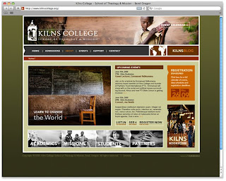
We are excited to announce the launch of the Kilns College School of Theology & Mission website! www.kilnscollege.org

The vision of Kilns College is an innovative school model that marries a classic educational approach with a missions and social justice focus. The school attracts Christian college students from around the nation who are passionate and committed to changing the world.

In designing the website, we first took into consideration what the communication goals were for the intended audience. The audience in this case is two-fold: Primarily, students and donors. The design challenge this presented was to create a website that appealed to these demographics equally, and in a visual language they could relate to.

By marrying beautiful, clean type with high-end photography and some elements of Flash programming, the site communicates both relevancy and professionalism. Although many students of the college are in the 20-30 yr range, the site was designed with a timeless sensibility. The design gives credit to this age group for being discerning in their choice of education and how they spend their time & money.

Development: Smart Solutions
Mission photography:
Benjamin Edwards

Thanks, everyone for bringing this site to life!